Graph Trends on seneye.me
Table of contents
[MISSING: System.API.no-headers]There are three different trends that you will see next to the graphs on your seneye.me dashboard.
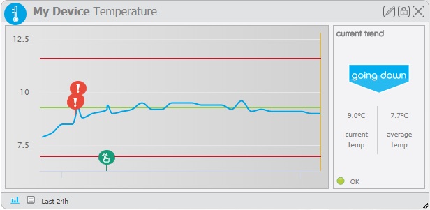
Going Down:
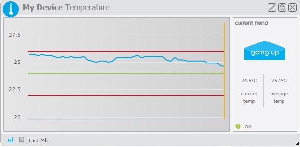
Going Up:
And Stable:
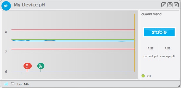
These are designed to give an instantaneous impression of the most recent data collected by your device for the individual parameters. They are calculated by finding the average value of all of the data uploaded to your dashboard throughout your device's lifetime and comparing this average against the most recent reading. If the most recent value for a parameter is greater than the average value for that parameter, the trend will show Going Up. If it is lower, it will show Going Down. If the value is similar enough to the average (within reason) the trend will show Stable.
Since the trend is calculated in regards to all data that has been uploaded by your device, it may seem to disagree with your graph at times. Even if the most recent reading is lower than the reading before it, the trend may still show Going Up. Because of this, Graph Trends should only be used as a rough picture of what is happening within your pond or aquarium environment.
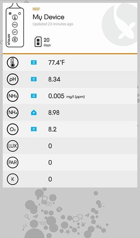
These trends are the same as on the seneye app for mobile devices, where the trends are displayed to the left of the recorded values on the overview page: